Scott
Driving traffic to your business is only half the battle. If your landing page design fails to engage visitors within the first few seconds, your marketing budget goes to waste. Successful landing page conversion optimization relies heavily on how information is structured and presented. To build a page that actually converts, you must understand what is a landing page conversion and how your design choices impact user decisions. This guide will cover actionable layout and typographic strategies to turn passive traffic into active users.
Part 1: Defining the goal: What is a landing page conversion?
Before diving into visual aesthetics, it is important to clearly define what is a landing page conversion. In digital marketing, a conversion occurs when a visitor completes a specific, desired action on your webpage. This could range from signing up for a software trial, subscribing to an industry newsletter, downloading an informational whitepaper, or completing a product purchase.
Unlike standard homepages that invite exploration through dozens of links, a structured landing page has a single, focused goal. Every visual asset, heading, and form field on that page should drive the visitor toward that singular action. When marketing teams invest in landing page conversion optimization, they are analyzing user behavior to eliminate cognitive load and remove roadblocks to decision-making.
Effective landing page design tips often emphasize that reducing friction is the fastest way to boost sign-ups. If a user cannot figure out what you are offering within five seconds, or if the form asks for too many details, they will abandon the page. To prevent this, your design must be strategic, clean, and highly structured. Let’s look at how modern design tools make it easier to build these high-converting experiences.
Part 2: Accelerating growth: Streamlined landing page design with Pixso
Historically, product and growth teams have relied on generalist tools like Figma or Sketch to construct their marketing web assets. While these platforms are strong for general user interface design, they often present roadblocks when applied to fast-paced growth marketing and conversion-focused projects. They typically lack built-in templates optimized for international markets, offer limited support for rapid variant management, and can make cross-functional collaboration tedious during tight launch schedules.
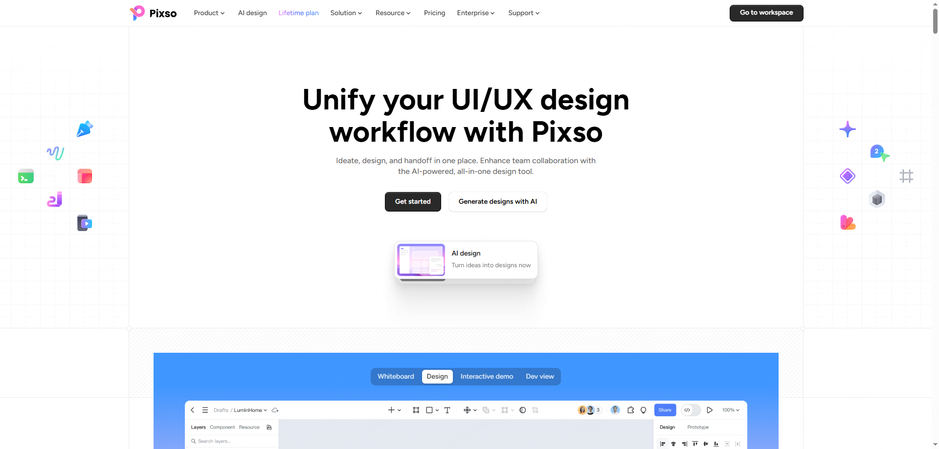
Pixso addresses these gaps directly. As a collaborative, cloud-based UI/UX design tool, Pixso integrates smart features and native AI capabilities specifically built to streamline how to design a landing page.
| PIXSO AI |
|
AI-Native English Layout Generation
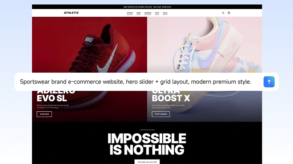
Instead of staring at a blank screen, Pixso’s native AI generator allows you to input descriptive English prompts to generate complete, vector-based landing page layouts instantly. Whether you are building a page for a SaaS platform, a niche e-commerce product, or an educational webinar, you can skip the wireframing phase and go straight to refining high-converting structures.
Library of Proven exemples
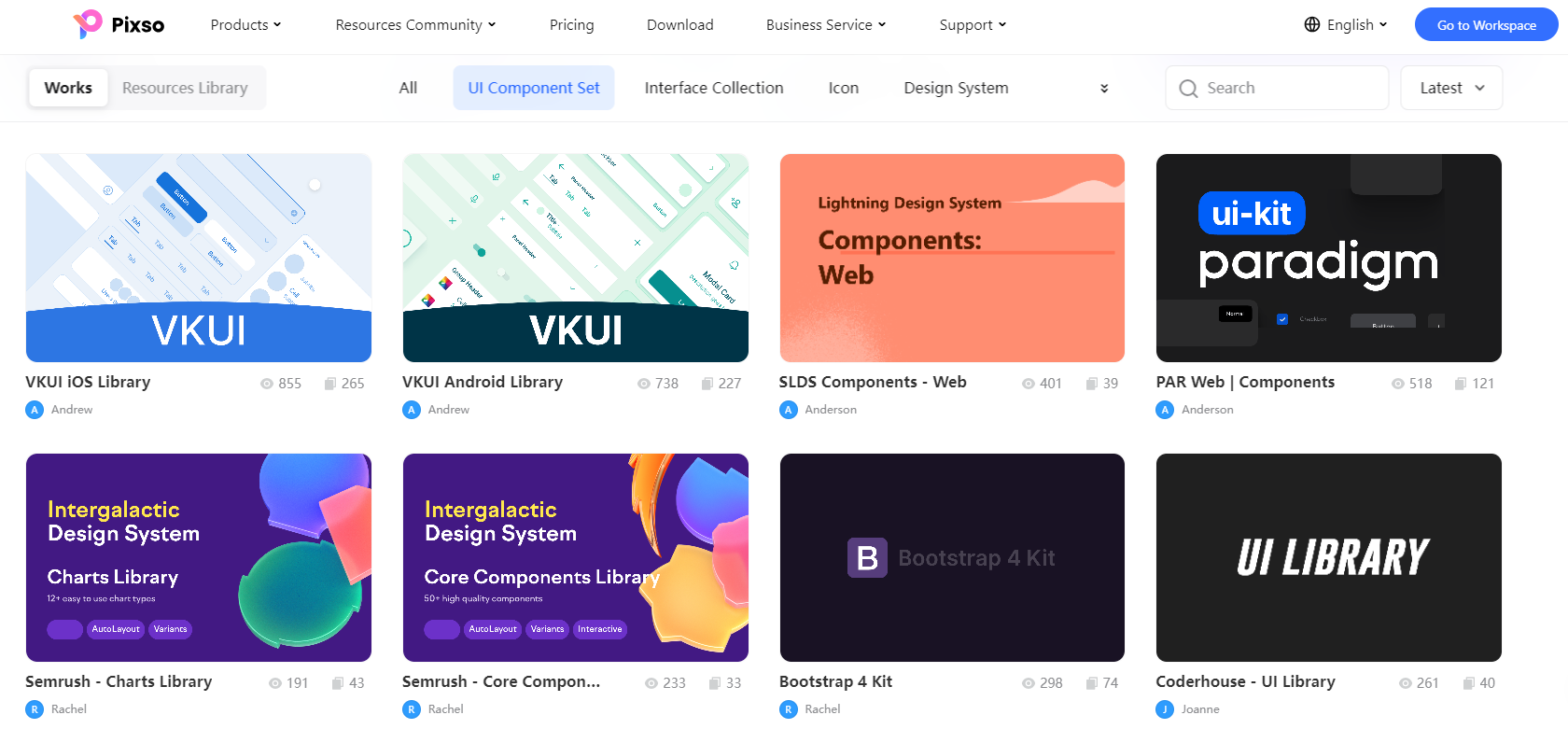
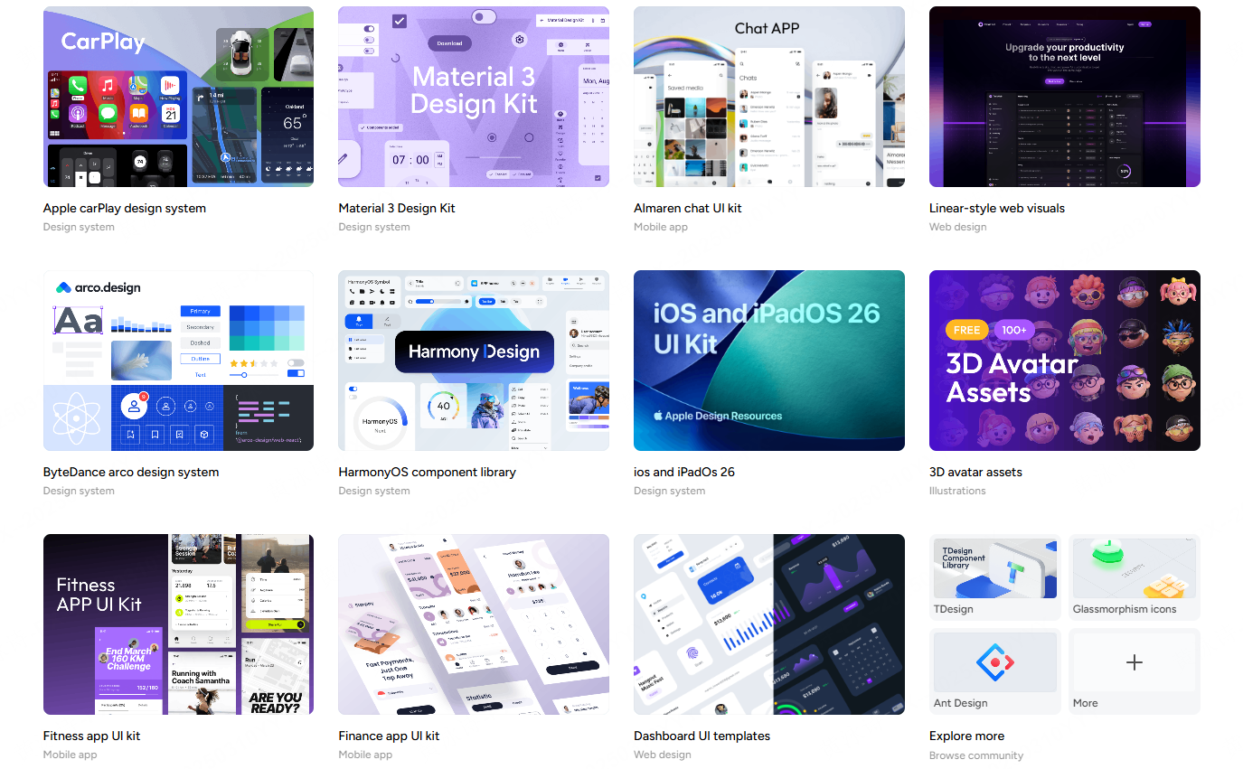
Rather than searching third-party marketplaces for design ideas, Pixso offers an extensive built-in library of landing page design examples and functional UI components. These templates are pre-structured according to modern conversion rules, ensuring your page is set up for success right from the beginning.
Compensating for Figma and Sketch Shortfalls
Traditional design tools often require you to manage multiple design files, external asset managers, and separate communication tools. Pixso solves these workflow bottlenecks by housing conversion-optimized UI resources, simplified layout management, and real-time cloud-based collaboration under one roof. Your marketing, design, and development teams can work together in the same workspace without file-conversion errors or communication delays.
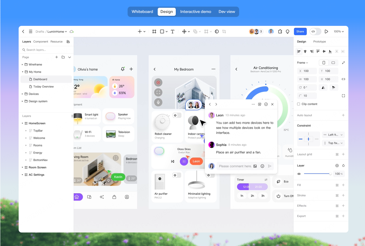
By shifting your landing page design pipeline to Pixso, you can transition from an initial concept to a polished, live-ready design while maintaining the high standards necessary for modern landing page conversion optimization.
Part 3: Layout psychology: Mastering the standardized reading flow
A core principle of successful landing page design is recognizing that online visitors do not read every word on a screen. Instead, they scan. To guide their eyes toward your call-to-action (CTA) button, your layout must respect international reading patterns.
The two most common visual journeys are the F-pattern and the Z-pattern.
- The F-Pattern: Most common on text-dense pages, where readers scan the main headline, read the first few bullet points, and then skim down the left side of the screen.
- The Z-Pattern: Highly effective for visual pages with lower text density. The user's eyes travel from the top-left (often where the logo is) to the top-right, down diagonally to the bottom-left, and finally across to the bottom-right CTA.
Understanding these scanning patterns allows you to position your most critical elements exactly where the user is already looking. To implement these patterns successfully, apply these landing page design best practices above the fold:
- The "Value Prop - Social Proof - Form CTA" Loop: Establish a fixed visual sequence. Place your unique value proposition clearly above the fold. Immediately follow it with trust-building social proof, such as customer logos, ratings, or user testimonials. Finally, place a lightweight form and an eye-catching CTA to capture the visitor's intent.
- Multi-Device Responsive Adaptation: A significant portion of your web traffic will access your page via mobile devices. Pixso automates this layout optimization with dynamic auto-layout features. Desktop elements shift seamlessly into mobile-optimized stacks, ensuring that your CTA buttons remain highly visible and easy to tap.
- Sticky Components and Pop-ups: To minimize friction, use sticky CTAs that remain pinned to the top or bottom of the screen as the user scrolls, along with lightweight pop-up forms to catch departing traffic.
Part 4: Typography and copy hierarchy: The silent conversion drivers
While a clean layout dictates where visitors look, your typography determines how easily they digest your message. Messy or inconsistent typography creates cognitive strain, which quickly leads to high bounce rates.
When exploring how to design a landing page, establishing a strict typographic hierarchy should be a top priority. Consider these key landing page design best practices for handling typography in English-market designs:
Restrict Your Font Palette
Limit your design to one or two clean, highly readable sans-serif fonts (such as Inter, Roboto, or Lato). Using too many font families makes a page look unprofessional and distracts from your primary message.
Establish a Standardized Typographic Scale
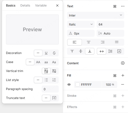
Maintain consistent, proportional sizes between your headlines, subheads, and body copy. Pixso includes pre-configured, professional English font scales that define exact font sizes, line heights, and line widths. This ensures your body copy is incredibly easy to read and scan.
Ensure Visual Contrast and Accessibility
Your copy is useless if visitors struggle to read it. Pixso features built-in accessibility checkers that automatically verify text-to-background contrast ratios against WCAG (Web Content Accessibility Guidelines) standards. High contrast keeps your value proposition readable on any screen, in any lighting.
Highlight Risk-Free Language
Draw immediate visual attention to risk-free terms like "No credit card required," "Free trial," or "Cancel anytime." By using subtle font weight shifts, bold styles, or distinct highlight containers, you can alleviate user hesitation and encourage quick sign-ups.
Part 5: Efficient iteration: A/B testing and product-to-dev handoff
Even the most beautiful layout is just a hypothesis until it meets real user traffic. Continuous growth requires constant testing and refinement, making rapid iteration a core tenet of landing page conversion optimization.
To run successful growth campaigns, design teams must be able to spin up page variations quickly. Pixso makes this process highly efficient:
- One-Click Duplication: Learning how to design a landing page involves running multiple variations at once to find what works. Pixso enables you to duplicate entire pages with a single click, allowing you to quickly swap out hero images, test different button placements, or run copy variations without disrupting your original layout. This supports growth teams in maintaining ongoing ad campaigns.
- Unified Component Systems: Create master components for recurring elements like signup forms and CTAs. If you need to test a button color across multiple landing page design examples, you can update the master component in Pixso and watch the change apply across all variants instantly.
- Smooth Handoff to Development: Once your designs are finalized, Pixso automatically generates clean CSS, SVG assets, and design system tokens. Developers can inspect layout values directly in the cloud, significantly reducing the transition time from design to live web page.
Part 6: Deconstructing landing page design examples & actionable checklist
To better understand these strategies, let's look at real-world landing page design examples and break down what makes them successful.
Consider a modern B2B software landing page. The hero section features a compelling headline, a subhead explaining the product's value, and a prominent primary button. Immediately below, a subtle row of customer logos establishes social proof. As you scroll, the page transitions into a clean two-column grid showcasing product benefits, ending with a direct, minimalist signup form.
Below is a quick checklist representing landing page design best practices to guide your next project:
| Design Phase | Target Element | Actionable Landing Page Design Tips |
| Phase 1: Above the Fold | Hero Layout | Align your headline, copy, and CTA button to match the Z-pattern reading flow. Keep the design clean and focused. |
| Phase 2: Trust Building | Social Proof | Place customer testimonials or partner logos immediately below the hero fold to build immediate trust. |
| Phase 3: Body Content | Benefit Sections | Use highly readable typography with sufficient line spacing. Limit paragraphs to 3 lines max for easy scanning. |
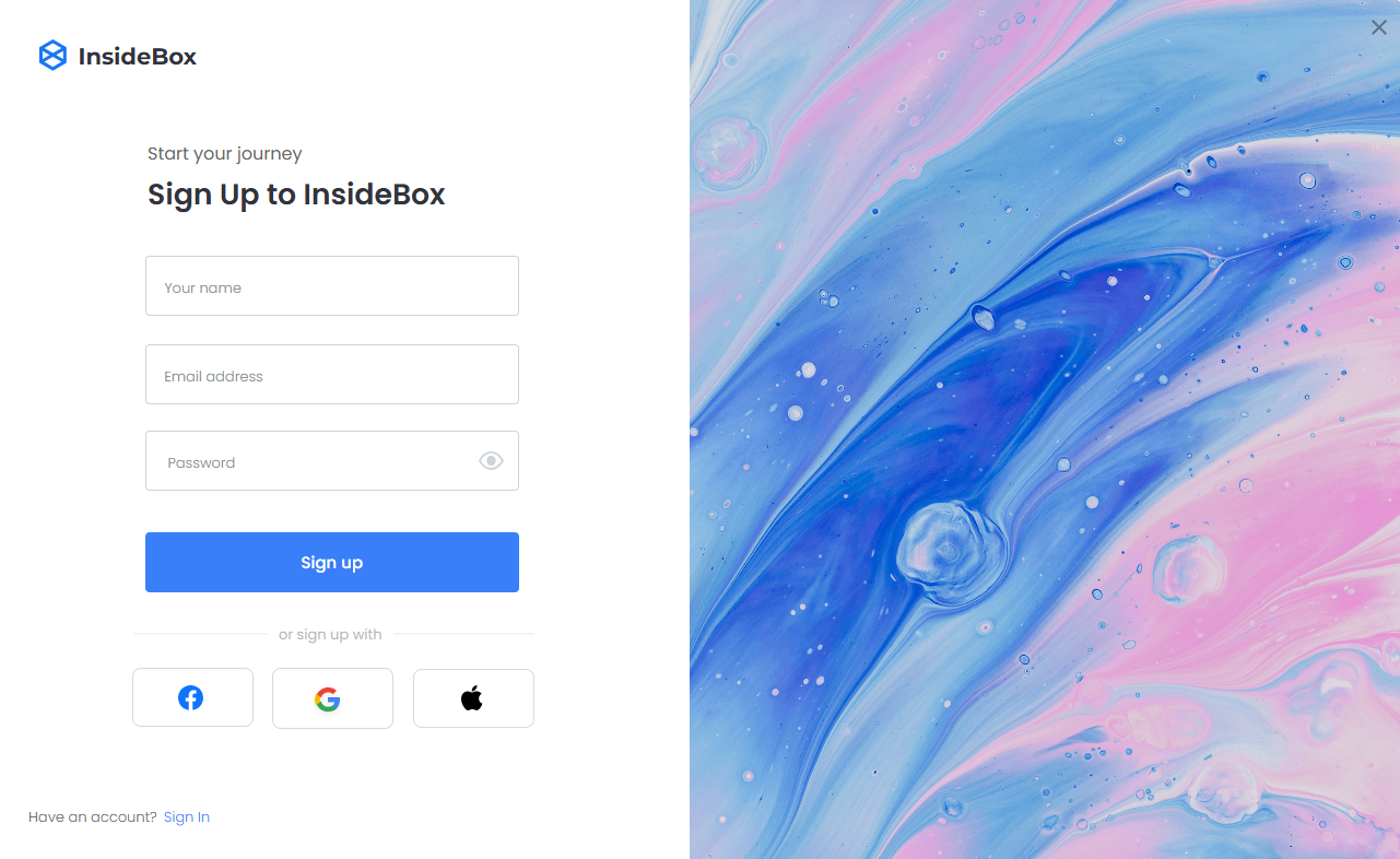
| Phase 4: Form Fields | Lead Capture | Minimize friction. Ask for only essential information (like email) and use a high-contrast button for your main CTA. |
| Phase 5: Technical Check | Accessibility | Run WCAG contrast checks on all text elements and ensure responsive mobile optimization is active. |
By systematically applying these principles and leveraging modern collaborative design tools, you can establish a design framework that consistently drives user acquisition.
Conclusion
Optimizing your landing page design is a continuous process of aligning visual hierarchy, typography, and messaging with user behavior. By focusing on proven reading flows, establishing a clean typographic hierarchy, and utilizing collaborative design platforms like Pixso, you can build engaging, accessible, and high-converting pages. Apply these practical landing page design tips to your next campaign, test your variations continuously, and watch your sign-up rates grow.