Scott
For online retailers, getting a shopper to add an item to their cart is a major victory, but the real challenge happens at the finish line. Nearly seventy percent of digital shopping carts are abandoned before a transaction is completed. Fortunately, optimizing your checkout screen is one of the most effective ways to reduce cart abandonment and lift your revenue. This guide covers seven critical checkout design strategies to help you master e commerce checkout optimization and turn more visitors into buyers.
Part 1: The high price of friction: Why e-commerce checkouts fail
If you want to reduce cart abandonment on your platform, you have to eliminate these friction points first. When customers land on a checkout screen, they are often on high alert. Any minor annoyance—whether it is a confusing form, a surprise shipping charge, or a forced account registration—will cause them to close the tab.
COMMON CHECKOUT ROADBLOCKS
- Forced Account Creation: Forcing buyers to register before paying
- Surprising Charges: Hiding shipping costs orlocal taxes until the end
- Complex Form Fields: Asking for redundant data without auto-completion
- Distracting Visuals: Displaying unnecessary navigation links
Effective e commerce ui design is not just about making a checkout page look clean. It requires managing user psychology, reducing cognitive load, and building trust.
True e commerce checkout optimization requires looking at the user journey as a psychological path. You must provide a continuous sense of progress, clear reassurance, and complete cost transparency. Let’s look at how utilizing the right design tools can help you establish this structure from day one.
Part 2: Accelerating checkout design with Pixso: The all-in-one e-commerce solution
To stand out, companies need e commerce ui design systems that can be updated rapidly. Traditional design software often slows down growth teams when they need to test variations of checkout layouts, leaving them to manually build each component and copy parameters individually.
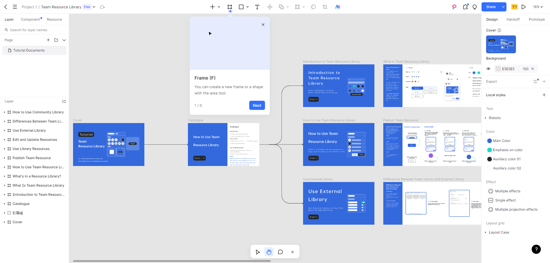
By shifting your design pipeline to Pixso, you gain access to tools built specifically for e commerce checkout optimization campaigns. Pixso integrates vector editing, interactive prototyping, and generative AI inside one collaborative cloud canvas.
E-commerce Checkout Asset Library
Pixso provides a robust, built-in library of conversion-ready assets. Instead of drawing form elements from scratch, designers can drag and drop pre-configured single-page or multi-step checkout layouts, shopping carts, exit-intent pop-ups, payment cards, and trust badges that match modern digital standards.
PIXSO E-COMMERCE AI WORKSPACE
- AI Generation: Input English prompts for complete checkout designs
- Flow Auditing: Automatically checkfor potential layout friction
- Design System Sync: One-click export of clean independent store code
Smart E-commerce AI Helper
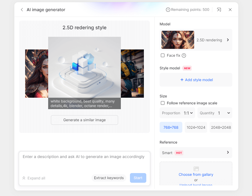
Pixso's native AI generator lets you build layouts using simple English prompts. For instance, entering a prompt like "minimalist checkout page with progress bar, shipping form, and secure payment buttons" generates a fully editable vector page in seconds.
The AI also helps you analyze your flows, identifying potential friction points like low-contrast buttons or crowded forms before you push designs to production.
Fast Prototyping and Code Handoff
Once your designs are finalized, Pixso bridges the gap to development. It automatically maps your UI styles to design tokens and generates clean, reusable frontend styling codes.
Whether you are building on Shopify, WooCommerce, or a custom independent platform, your engineers can copy layout spacing, typography parameters, and button tokens directly from the cloud workspace, ensuring your final live site matches the layout exactly.
Part 3: UX tips 1-3: Designing low-friction checkout flows and guest forms
Let's explore several practical ux design tips focused on the initial purchase stages. These strategies are designed to simplify the user journey and encourage quick conversions.
Tip 1: Prioritize Guest Checkout
Never force a first-time buyer to create an account before they can pay. This is one of the most common reasons for abandoned transactions.
Make your "Guest Checkout" option prominent and clear. Pixso’s template library features layouts that place guest checkout buttons in high-visibility zones, allowing buyers to complete their orders using only an email address.
Additionally, use autofill tools, address completion APIs, and automated progress indicators to make form-filling painless.
GUEST CHECKOUT FLOW
Select Guest Checkout ➔ Enter Email ➔ Pay Instantly
Account creation offered only after the payment is done
Tip 2: Keep Pricing Completely Transparent
Surprise costs at the final step of a transaction are a major conversion killer. Build transparent pricing modules directly into your shopping cart design.
Your checkout page must display a clear, itemized list breaking down the subtotal, local taxes, shipping fees, and any active discounts. Establishing this layer of clarity is one of the easiest ways to reduce cart abandonment from price shock.
Tip 3: Display Clear Trust Signals
To encourage users to enter their credit card details, you must make them feel secure. Place recognizable security locks, PCI-compliance badges, and star ratings near the payment form.
Pixso's template library includes pre-built checkout modules featuring structured grids for safety seals and customer support details, ensuring these elements remain visible without distracting from the primary CTA.
Part 4: UX tips 4-5: Mobile-first optimization and interactive safeguards
A significant amount of e-commerce traffic originates from mobile devices. If your checkout page is not optimized for smaller screens, your sales will suffer.
When designing for mobile, consider these essential mobile ux design tips to streamline checkout paths:
Tip 4: Build for Mobile-First Touch Targets
High-quality e commerce ui design defaults to a single-column stacked view on mobile screens. Buttons must be large enough to tap easily, and input fields should trigger the appropriate mobile keyboard (such as numeric pads for phone numbers and zip codes).
Pixso features auto-layout tools that let you build responsive layouts that scale to mobile screens dynamically, complete with sticky footer checkout buttons that remain locked at the bottom of the screen as the user scrolls.
MOBILE TOUCH LAYOUT
- Single-Column Stack: Easier to read on vertical screens
- Sticky Checkout CTA: High-contrast button locked at bottom
- Large Input Fields: Sized for easy typing on mobile keys
Tip 5: Use Real-time Form Validation and Exit-Intent Protections
Do not wait until a buyer clicks the final submit button to tell them they entered an invalid phone number. Instead, use real-time validation to display inline checkmarks or red warning boxes as they type.
Additionally, use exit-intent pop-ups to offer a small discount or save the user's cart draft if they move their cursor toward the close button. Pixso makes it easy to prototype these pop-ups and transition triggers, allowing you to test how they look and behave before coding.
Part 5: UX tips 6-7: Global readiness, RTL layouts, and local compliance
Scaling your brand globally requires adapting your checkout page for different languages, reading directions, and regional regulatory compliance rules.
Tip 6: Localize Layouts for International Markets
When translating your site, text length will vary significantly. German and Spanish copy can be much longer than English, while Arabic and Hebrew require a complete Right-to-Left (RTL) mirror layout.
BIDIRECTIONAL MIRROR FLOW
English (LTR): Input Label -> Form Field
Arabic (RTL): Form Field <- Input Label
Pixso handles these layout variations with ease. It features automated multi-language artboards side-by-side, allowing you to verify that your fields do not overflow in different languages.
Additionally, Pixso includes full bidirectional text and RTL mirroring tools, allowing you to switch layout directions with a single click to serve Middle Eastern markets seamlessly.
Tip 7: Build for International Compliance
To avoid heavy fines and build customer trust, your checkout page must meet local privacy standards like GDPR (Europe) and CCPA (California).
Use clear, un-checked consent boxes for marketing opt-ins and include direct links to your data privacy policies next to your lead capture fields. Pixso's library features pre-built, compliant checkout footer templates that make it easy to incorporate these checkboxes into your designs.
Part 6: From design to production: Running continuous A/B tests
Designing an optimized layout is only half the battle. To maintain high sales, your design and marketing teams must run ongoing A/B tests to discover what elements resonate with your target market.
Continuous A/B testing is a critical pillar of e commerce checkout optimization. You should regularly test different visual variables to find the highest-converting combination:
- CTA Button Colors: Test high-contrast options like bright orange, green, or deep blue against your brand colors.
- Checkout Architectures: Run multi-step progress bars against clean single-page checkout structures.
- Security Badge Placements: Test placing trust seals immediately above the card number field versus at the bottom of the form.
Pixso makes running these tests fast and efficient. You can duplicate entire pages with one click, modify your elements, and export clean CSS, SVG assets, and design parameters to your testing framework instantly. Apply these ux design tips to your interface and watch your performance improve.
Conclusion
Maximizing conversions at checkout requires constant refinement of your form fields, trust signals, mobile layouts, and international settings. By utilizing modern, unified design environments like Pixso, you can skip tedious manual wireframing and build high-fidelity checkout pages that conform to global best practices. Set up your workspace, run tests on your layouts, and watch your conversion rates grow.
![[2025] Best UI Animation Tools](https://cms.pixso.net/images/articles/ui-animation-tools.png)