Scott
Contrasting colors are everywhere in our daily lives. Formed by pairing hues that sit directly opposite each other on the color wheel, they allow designers to forge highly impactful visual experiences. Before we unpack what are complementary colors and how they are used, let's establish some fundamental concepts regarding color in design.
Part 1. What Are Contrasting Colors
In visual design, contrasting colors typically refer to pairs that sit directly opposite one another across the diameter of the color wheel. If you draw a straight line through the center of a pure color wheel, the endpoints represent complementary colors. Classic examples include red and green, yellow and purple, and blue and orange.
This concept is deeply rooted in the additive color theory of light. Under the RGB (red, green, blue) spectrum, mixing these three primary light colors results in pure white light. When one primary color is combined with its exact opposite (which is the sum of the other two primary colors), they neutralize each other to produce white light. This optical phenomenon forms the basis for complementary colors, explaining how opposite wavelengths interact dynamically.
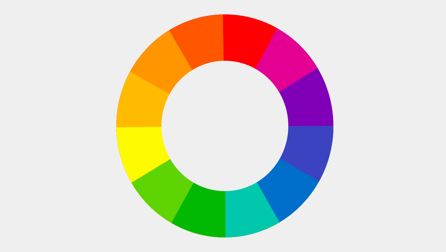
Employing opposite hues is a standard technique when working with color combinations. Due to their extreme variance, contrasting colors establish high visual tension, making key elements pop instantly on any digital layout.
Creating Visual Impact
The stark difference between opposite colors naturally captures a user's attention. In marketing and advertising, designers leverage these pairings to direct focus to high-priority elements, such as a company logo, brand name, or call-to-action button.
Enhancing Information Delivery
In graphic design and digital illustration, opposite color choices can significantly increase expressive power. For example, in children's book illustrations, using opposite color pairings makes scenes appear much more vivid and memorable, strengthening narrative communication.
Elevating the Aesthetic Experience
In interior decoration and fashion, pairing opposites breaks visual monotony. When handled skillfully, it adds a layer of sophistication, interest, and dynamic energy to the overall space.
Part 2. Common Color Combinations
2.1 Black and White Contrast
In the design world, black and white represent a classic and highly effective pairing. As opposites on the value scale, they create the most extreme value contrast possible, making layouts look incredibly striking and clean. This is heavily utilized in typographic layouts, editorial design, and web interfaces.
For example, in poster design, placing white text on a solid black background immediately emphasizes the copy and improves legibility. In user experience design, this extreme contrast helps establish a logical reading hierarchy and guides user behavior.
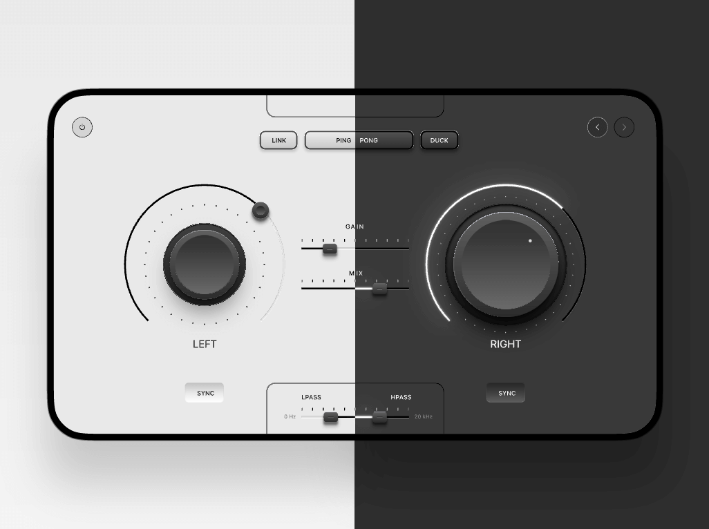
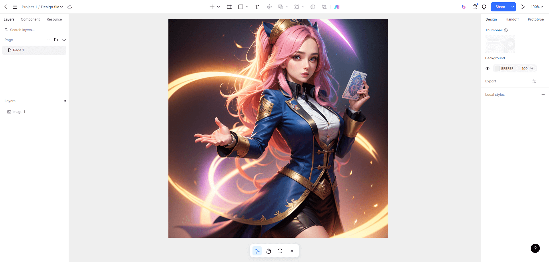
Pixso offers extensive libraries of ready-made design assets, such as the Skeuomorphic Illustration Design Template available for free download, allowing designers to study high-contrast layer structures easily.
Beyond black and white, several other classic pairs can be adapted based on the visual objectives of your project, including red/green, blue/yellow, and purple/orange combinations.
2.2 Complementary Contrast
This contrast relies on exact opposites on the color wheel. When paired, they make each other appear more vivid and luminous. Standard examples include:
- Red and Green: The ultimate classic pair. Red represents warmth, passion, and energy, while green offers natural tranquility and balance. Designers use this pairing to direct attention or trigger an immediate emotional response.
- Blue and Orange: Highly popular in modern corporate UI and digital products. Blue represents stability, trust, and professionalism, while orange injects vitality and warmth. This combination balances cool professionalism with inviting energy.

- Yellow and Purple: A vibrant, high-contrast pairing. Yellow represents optimism and cheerfulness, whereas purple conveys luxury, creativity, and mystery.

These complementary colors can be adjusted in saturation and brightness to fit the emotional tone of your specific digital product.
2.3 Cool and Warm Contrast
This contrast creates atmospheric tension by juxtaposing temperature-related associations. Standard warm-cool color combinations include:
- Blue and Orange: Cold, deep water vs. fiery warmth, creating high visual energy.
- Green and Red: Calm foliage vs. vivid heat, generating a lively and organic atmosphere.
- Purple and Yellow: Mysterious, cool shadows vs. warm solar light, creating a sophisticated and romantic feel.
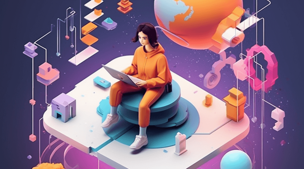
- Cyan and Pink: Fresh, quiet cool vs. gentle, romantic warm, excellent for modern editorial layouts and youth-oriented branding.

2.4 Saturation Contrast
Beyond hue and light, saturation (the purity or vividness of a color) plays a major role in how we perceive color in design. By contrasting different saturation levels, designers can evoke different emotional responses:
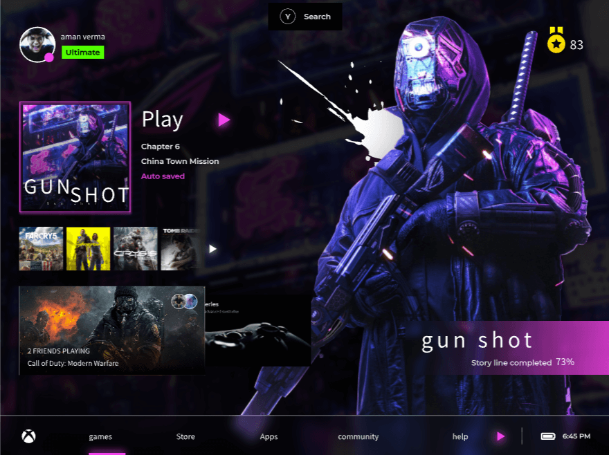
- High Saturation Contrast: Pairing highly saturated opposite colors yields maximum visual noise, perfect for catching eyes in advertising. For instance, neon red and bright green create a massive visual impact.
- Low Saturation Contrast: Muted tones (like pastel blue and soft ochre) create a gentle, sophisticated, and comfortable atmosphere.
- Saturation Gradient Contrast: Progressing from a saturated hue to its muted counterpart (e.g., deep red transitioning into soft dusty rose) creates smooth, elegant transitions.
2.5 Brightness/Value Contrast
When working with light and dark color combinations, keep these guidelines in mind:
- Ensure clarity: The light-dark difference must be strong enough to meet digital accessibility standards (such as WCAG AA or AAA ratios).
- Avoid visual strain: Overly harsh brightness contrast can cause eye fatigue.
- Account for background colors: Ensure the contrast harmonizes with surrounding neutral spaces to preserve balance.
Part 3. Practical Application Scenarios
3.1 Advertising Design
In marketing, contrasting colors are used to make promotional material instantly recognizable:
- Brand Identity: Many iconic logos use high-contrast combinations to stand out. Coca-Cola's classic red-and-white pairing ensures immediate recognition across various mediums.
- Product Packaging: Vibrant opposite colors make boxes and bottles jump off retail shelves. For example, some premium hair-care brands use clean black-and-white graphics to establish a minimalist, high-end feel.
- Poster Design: High contrast guides the reader’s eye directly to conversion points. For instance, in a fitness banner design, using sharp red accents against a deep charcoal background conveys raw power and action. Designers can download a fitness banner design template on Pixso for free.
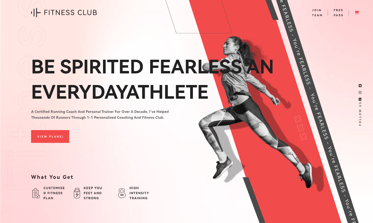
- Web Design: Web storefronts frequently pair cool background colors with warm accent buttons (like a bright orange "Add to Cart" button on a deep blue layout) to drive micro-conversions.
3.2 Web UI/UX Design
In the digital space, using contrasting colors correctly ensures that interfaces are both beautiful and usable:
- Navbars and Headers: Black text on white backgrounds (or vice-versa) establishes clear navigational pathways.
- Buttons and Links (Call to Action): To encourage clicks, interactive elements are usually rendered in vivid accent colors that stand out against the primary background color. Pixso offers pre-built UI kits and home page design templates to jumpstart these layouts.
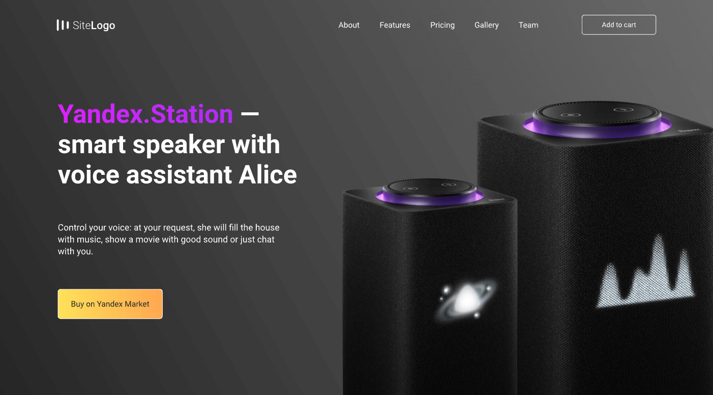
- Alerts and Errors: High-contrast warning systems (like bright yellow or red warning boxes) demand immediate user attention to prevent system mistakes.
- Images and Backgrounds: Placing colorful imagery against deep dark backdrops increases overall visual depth.
3.3 Interior Design
In physical spaces, using complementary colors helps balance sensory energy. A bedroom painted in soothing cool tones might feature warm wooden accents or golden lighting fixtures to keep the space from feeling cold or uninviting. Designers can customize these color palettes according to the room's function.
3.4 Brand Identity
A well-chosen color scheme communicates a brand's personality, values, and industry positioning. Using contrasting colors in logo design increases readability across print, digital screens, and merchandise. Designers generally follow a few key guidelines when establishing these identities:
- Contrast Level: Ensure the colors are highly distinguishable to maximize legibility.
- Brand Alignment: Ensure the color palette reflects the industry and target demographic.
- Emotional Association: Select hues that trigger the correct psychological response.
Part 4. How to Implement Opposite Color Combinations
To use contrasting colors effectively, never pair them at identical levels of saturation and brightness. One color must dominate (usually the cool or neutral tone), while the opposite color acts as a surgical accent.
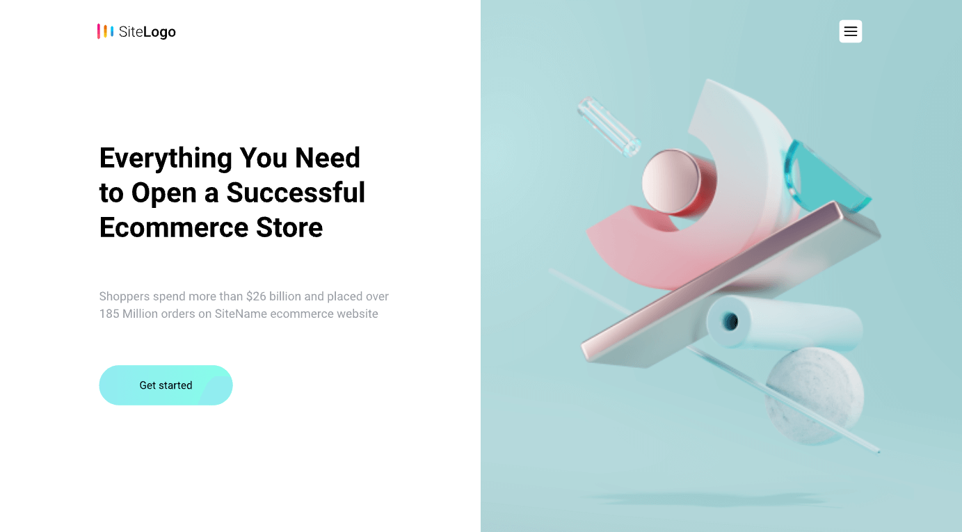
For example, if your primary layout is deep blue, use orange highlights exclusively for buttons or key metrics. Too much of both colors will fight for dominance and cause eye strain. Additionally, these color combinations can be used to direct visual flow. On a landing page, an orange CTA button placed on a cool blue backdrop acts as a visual signpost, showing the user exactly where to click next. You can download landing page templates on Pixso for free.
Part 5. Professional Online Coloring Tools
Pixso is a professional design software dedicated to providing creators with robust tools to satisfy their creative needs. Among its many capabilities, Pixso's coloring and palette management tools are highly favored by designers.
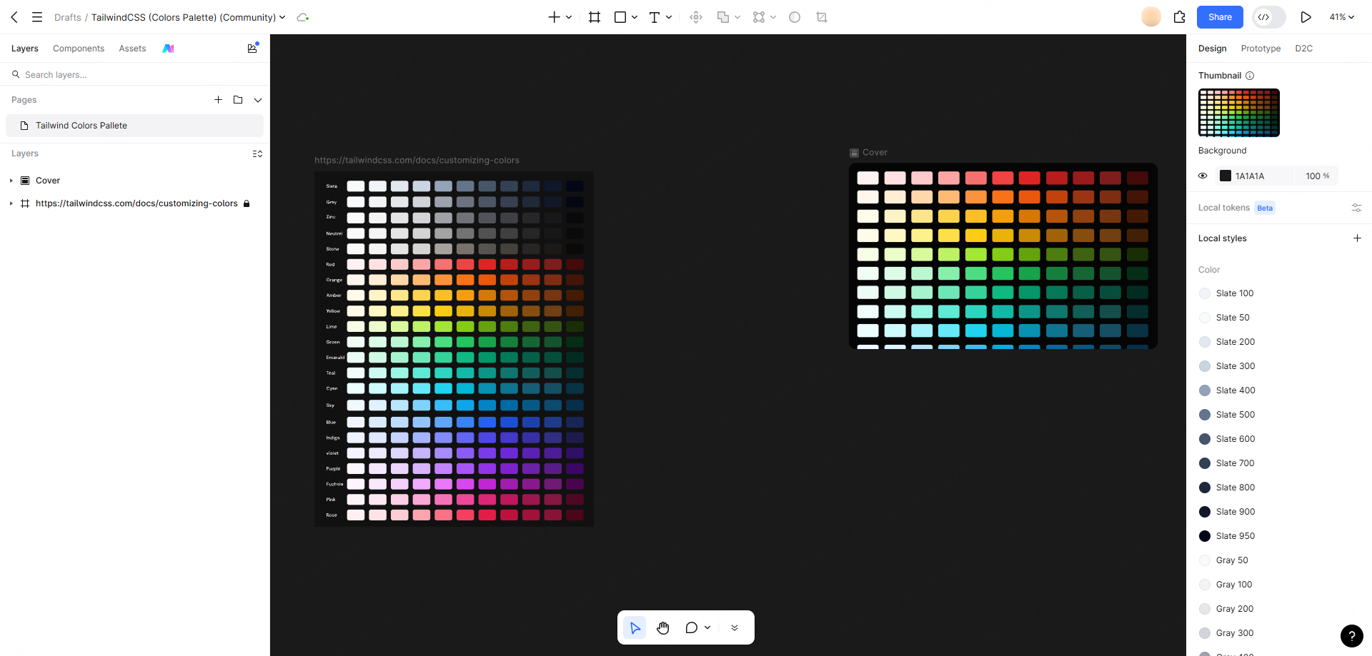
Using Pixso to build and test your color combinations offers several distinct advantages:
- Easy Palette Management: You can easily build, organize, and name custom palettes directly inside your workspace, making it simple to retrieve specific hues later.
- Pre-built Color Library: Pixso provides a rich library of trending, popular color schemes. Whether you need a vintage feel or a clean, modern aesthetic, you can import harmonized palettes with a single click.
- Intuitive Color Picker: Select exact hexadecimal or RGB values, modify alpha transparency, and fine-tune your color balance dynamically.
- Collaborative Sharing: You can share your color libraries with team members in real time. This ensures that everyone uses consistent assets, preventing messy layout updates during production.
To help teams map out early color concepts, flowcharts, and brand guidelines collaboratively, the Pixso Whiteboard serves as an excellent starting point before jumping into high-fidelity UI layout files. Pixso's individual plan is free forever, making it a highly accessible platform for learning color theory in real-world scenarios.
Final Thoughts
Contrasting colors are a fundamental design asset that helps guide user attention, organize layout hierarchies, and inject energy into quiet visual spaces. Understanding the physics of how opposite colors neutralize and enhance each other allows you to build more effective layouts.
By testing these combinations inside a professional design platform like Pixso, you can build unified palettes, share brand libraries with your team, and export high-fidelity files that look beautiful in hand. Now that you understand the rules of opposites, try applying them to your next creative layout!